Speaking of water supply problems, welcome to Flint, Michigan. There have been a lot of coverage in the news about the troubles in Flint the last couple of months. However if you read between the lines you see two issues – first this is not new – it is several years old, going back to when the City’s water plant came back on line in May 2014. Second this was a political/financial issue not a public health issue. In fact, the political/financial goals appear to have been so overwhelming, that the public health aspects were scarcely considered. Let’s take a look at why.
Flint’s first water plant was constructed in 1917. The source was the Flint River. The second plant was constructed in 1952. Because of declining water quality in the Flint River, the city, in 1962, had plans to build a pipeline from Lake Huron to Flint, but a real estate scandal caused the city commission to abandon the pipeline project in 1964 and instead buy water from the City of Detroit (source: Lake Huron). Flint stopped treating its water in 1967, when a pipeline from Detroit was completed. The City was purchasing of almost 100 MGD. Detroit declared bankruptcy. The City of Flint was basically bankrupt. Both had appointed receivers. Both receivers were told to reduce costs (the finance/business decisions). The City of Flint has purchased water for years from Detroit as opposed to using their Flint River water plant constructed in 1952. The Flint WTP has been maintained as a backup to the DWSD system, operating approximately 20 days per year at 11 MGD.
The City of Flint joined the Karegnondi Water Authority (KWA) in 2010. The KWA consists of a group of local communities that decided to support and fund construction of a raw water pipeline to Lake Huron. The KWA was to provide the City of Flint Water Treatment Plant with source water from Lake Huron. An engineer’s report noted that a Genesee County Drain Commissioner stated that one of the main reasons for pursuing the KWA supply was the reliability of the Detroit supply given the 2003 power blackout that left Flint without water for several days. Another issue is that Flint no say in the rate increases issued to Flint by Detroit. Detroit’s bankruptcy may also have been a factor given the likelihood of increased prices. While discussion were ongoing for several years thereafter, the Detroit Free Press reported a 7-1 vote in favor of the KWA project by Flint’s elected officials in March, 2013. The actual agreement date was April 2013. The cost of the pipeline was estimated to be $272 million, with Flint’s portion estimated at $81 million.
The City of Detroit objected due to loss of revenues at a time when a receiver was trying to stabilize the city’s finances (in conjunction with the State Treasurer). In February 2013, the engineering consulting firm of Tucker, Young, Jackson, Tull, Inc. (TYJT), at the request of the State Treasurer, performed an analysis of the water supply options being considered by the City of Flint. The preliminary investigation evaluated the cost associated with the required improvements to the plant, plus the costs for annual operation and maintenance including labor, utilities, chemicals and residual management. They indicated that the pipeline cost was likely low and Flint’s obligation could be $25 million higher and that there was less redundancy in the KWA pipeline than in Detroit’s system. In 2013, the City of Detroit made a final offer to convince Flint to stay on Detroit water with certain concessions. Flint declined the final Detroit offer. Immediately after Flint declined the offer, Detroit gave Flint notice that their long-standing water agreement would terminate in twelve months, meaning that Flint’s water agreement with Detroit would end in April 2014 but construction of KWA was not expected to be completed until the end of 2016.
It should be noted that between 2011 and 2015, Flint’s finances were controlled by a series of receivers/emergency managers appointed by the Governor. Cutting costs was a major issue and clearly their directive from the Governor. Cost are the major issue addressed in the online reports about the issue. Public health was not.
An engineering firm was hired as the old Flint River plan underwent $7 million in renovations in 2014 to the filters to treat volumes of freshwater for the citizens. The project was designed to take water from the Flint River for a period of time until a Lake Huron water pipeline was completed. The City of Flint began using the Flint River as a water source in May of 2014 knowing that treatment would need to be closely watched since the Michigan Department of Environmental Quality in partnership with the U.S. Geological Survey, and the City of Flint Utilities Department conducted a source water assessment and determined the susceptibility of potential contamination as having a very high susceptibility to potential contaminant sources (take a look at this photo and see what you think).

Flows were designed for 16 MGD. Lime softening, sand filters and disinfection were in place. Everything sounded great. But it was not. Immediately, in May and August of 2014, TTHM samples violated the drinking water standards. This means two things – total organic carbon (TOC) in the water and additional chlorine being added to disinfect and probably reduce color caused by the TOC. Softening does not remove TOC. Filtration is not very effective either. High concentration usually needs granular activated carbon, ion exchange or membranes. The flint plant had none of these, so the carbon staying in the water. To address the TTHM issue, chlorine appears to have been reduced as the TTHM issue was in compliance by the next sampling event in Nov 2014. However, in the interim new violations included a total coliform and E. coli in August and September of 2014, and indication of inadequate disinfection. That means boil your water and lots of public outcry. The pH, salinity (salt) and other parameters were reported to be quite different than the Detroit water as well. A variable river system with upstream agriculture, industry and a high potential for contamination, is not nearly as easy to treat as cold lake water. These waters are very different as they City was to find. What this appears to indicate is that the chemistry profile and sampling prior to conversion and startup does not appear to have been fully performed to identify the potential for this to occur or this would have been discovered. This is now being suggested in the press.
The change in water quality and treatment created other water quality challenges that have resulted in water quality violations. Like most older northern cities, the water distribution system in almost 100 years old. As with many other municipalities at the time, all of the service lines from the cast iron water mains (with lead joints) to end users homes were constructed with lead goosenecks and copper lines. Utilities have addressed this with additive to prevent corrosion. In the early 1990s water systems were required to comply with the federal lead and copper rule. The concept was that on the first draw of water in the morning, the lead concentration should not exceed 0.015 mg/L and copper should not exceed 1.3 mg/L. Depending on the size of the utility, sampling was to be undertaken twice and a random set of hoses, with the number of samples dependent on the size of the system. The sampling was required to be performed twice, six months apart (note routine sampling has occurred since then to insure compliance). Residents were instructed on how to take the samples, and results submitted to regulatory agencies. If the system came up “hot” for either compound, the utility was required to make adjustments to the treatment process. Ideally water leaving the plant would have a slightly negative Langlier saturation index (LSI) and would tend to slightly deposit on pipes. Coupon tests could be conducted to demonstrate this actually occurred. As they age, the pipes develop a scale that helps prevent leaching. Most utilities tested various products. Detroit clearly did this and there were no problems. Flint did not.
The utility I was at was a perfect 100% non-detects the first time were tested. We had a few detections of lead and copper in samples the second time which really bothered me since the system was newer and we had limited lead in the lines. I investigated this and found that the polyphosphate had been changed because the County purchasing department found a cheaper product. I forced them to buy the old stuff, re-ran the tests and was again perfect. We instructed our purchasing department that saving a few bucks did not protect the public health, but the polyphosphate product did. Business and cost savings does not trump public health! Different waters are different, so you have to test and then stay with what works.
Now fast forward to Flint. They did not do this testing. The Flint River water was different that Detroit’s. Salinity, TOC, pH and overall quality differed. Accommodations were not made to address the problem and the state found no polyphosphates were added to protect the coatings. Veolia reported that the operations needed changes and operators needed training. Facilities were needed to address quality concerns (including granular activated carbon filter media). As a result the City appears to have sent corrosive water into the piping system, which dissolved the scale that had developed over the years, exposing raw metal, and created the leaching issue. Volunteer teams led by Virginia Tech researchers reported found that at least a quarter of Flint households have levels of lead above the federal level of 15 ppb, and as high as 13,200 ppb. Aging cast-iron pipe compounded the situation, leading to aesthetic issues including taste, odor and discoloration that result from aggressive water (brown water). Once the City started receiving violations, public interest and scrutiny of the drinking water system intensified.
The City Commission reportedly asked the receiver to switch back to Detroit water, but that request was initially rebuffed and the damage to pipes continued. Finally in October 2015, the water supply was switched back to Detroit and the City started adding additional zinc orthophosphate in December 2015 to facilitate the buildup of the phosphate scale eroded from the pipes by the Flint River water. But that means the pipes were stable, then destabilized, now destabilized again by the switch back. It will now take some time for the scale to rebuild and to lower lead levels, leaving the residents of Flint at risk because of a business/finance/political decision that had not consideration of public health impacts. And what is the ultimate fate of the KWA pipeline?
Just when things were starting to look up (?), in January 2016, a hospital in Flint reported that low levels of Legionnaires’ disease bacteria were discovered in the water system and that 10 people have died and another 77 to 85 affected. From the water system? A disinfection problem? Still TOC in the water? The lawsuits have begun but where does the problem lie? Let’s look at Walkerton Ontario for guidance in the aftermath of their 2000 incident.
First it is clear that public health was not the primary driver for the decisions. Treating water is not as simple as cost managers think. You need to understand what water quality, piping quality and stabilization you have and address the potential issues with new water sources. Membrane systems are very familiar with these challenges. Cost cannot be the driver. The Safe Drinking Water Act does not say cost is a consideration you use to make decisions. Public health is. So the initial decision-making appears to have been flawed. Cost was a Walkerton issue – cost cannot be the limiting factor when public health is at risk.
The guidance from consultants or other water managers is unclear. If the due diligence of engineers as to water quality impacts of the change in waters was not undertaken, the engineering appears to have been flawed. If the engineer recommended, and has lots of documentation saying testing should be done, but also a file full of accompanying denials from the receivers, another flawed business decision that fails the public health test. If not, I see a lawsuit coming against the consultants who failed in their duty to protect the public health, safety and welfare.
The politics is a problem. A poor community must still get water and sewer service. Consultants that can deal with rate and fee issues should be engaged to address fairness and pricing burdens. Was this done? Or was cutting costs the only goal? Unclear. The politics was a Walkerton issue.
Was the water being treated properly? Water quality testing would help identify this. Clearly there were issues with operations. Telling the state phosphates were used when they were not, appears to be an operations error. Walkerton also had operations issues as well. A major concern when public health is at risk. Veolia came to a similar conclusion.
The state has received its share of blame in the press, but do they deserve it? The question I have is what does the regulatory staff look like? Has it been reduced as the state trims its budget? Are there sufficient resources to insure oversight of water quality? The lack of provincial resources to monitor water quality was an issue in Walkerton – lack of oversight compounded local issues. That would then involve the Governor and Legislature. Politics at work. Likewise was there pressure applied to make certain decisions? If so, politics before public heath – a deadly combination.
So many confounding problems, but what is clear is that Flint is an example of why public utilities should be operated with public health at the forefront, not cost or politics. Neither cost of politics protect the public health. While we all need finances to pay for our needs, in a utility, money supports the operations, not controls it. We seems to have that backward. Private entities look sat controlling costs. Public agencies should look at public service first; cost is down the list. We need the operations folks to get the funds needed to protect the public health. And then we need to get the politicians to work with the staff to achieve their needs, not limit resources to cut costs for political gain. Ask the people in Flint.
So is Flint the next Walkerton? Will there be a similar investigation by outside unconnected people? Will the blame be parsed out? Is there a reasonable plan for the future? The answers to these questions would provide utilities with a lot of lessons learned and guidance going forward and maybe reset the way we operate our utilities. Happy to be a part of it if so!

 s:
s:


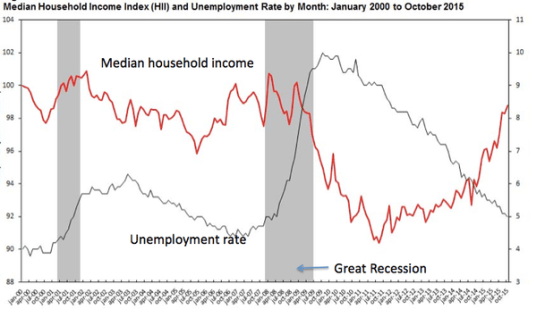
 One of the issues I always include in rate studies is a comparison of water rates with other basic services. Water always comes in at the bottom. But that works when everyone has access and uses those services. Several years ago a study indicated that cable tv was in 87-91 % of home. At the time I was one of the missing percentage, so I thought it was interesting. However, post the 2008 recession, and in certain communities, this may be a misplace comparison. A recent study by Emmanuel Saez and Gabriel Zucman notes that the top 0.1% have assets that are worth the same as the bottom 90% of the population! Yes, you read that correctly. Occupy Wall Street had it wrong. It’s not the 1% it is the 0.1%. This is what things were like in the 1920s, just before the Great Depression. The picture improved after the implementation of tax policies (the top tax rate until 1964 was 90% – yes you read that right – 90%). Then the tax rate was slowly reduced to deal with inflation. The picture continued to improve until supply side economics was introduced in the early 1980s when the disparity started to rise again (see their figure below), tripling since the late 1970s (you recall the idea was give wealthy people more money and they would invest it in jobs that would increase employment opportunities and good jobs for all, or something like that). Supply side economics did not/does not work (jobs went overseas), and easy credit borrowing and education costs have contributed to the loss of asset value for the middle class as they strove to meet job skills requirements for better jobs. In addition wages have stagnated or fallen while the 0.1% has seen their incomes rise. The problem has been exacerbated since 2008 as they report no recovery in the wealth of the middle class and the poor. So going back to my first observation – what gets cut from their budget, especially the poor and those of fixed pensions? Food? Medicine? Health care? My buddy Mario (86 year old), still works because he can’t pay his bills on social security. And he does not live extravagantly. So do they forego cable and cell phones? If so the comparison to these costs in rate studies does not comport any longer. It places at risk people more at risk. And since, rural communities have a lower income and education rate than urban areas, how much more at risk are they? This is sure to prove more interesting in the coming years. Hopefully with some tools we are developing, these smaller communities can be helped toward financial and asset sustainability. But it may require some tough decisions today.